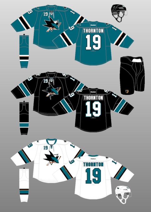
2023-24
2022-23
2021-22
2021
2019-20
2018-19
2017-18
2016-17
2015-16
2014-15
2013-14
2013
2011-12
2010-11
2009-10
2008-09
2007-08
2006-07
2005-06
2004 WCH
2003-04
2002-03
2001-02
2000-01
1999-2000
1998-99
1997-98
1996-97
1995-96
1995
1993-94
1992-93
1991-92
1990-91
1989-90
1988-89
1987-88
1986-87
1985-86
1984-85
1983-84
1982-83
1981-82
1980-81
1979-80
1978-79
1977-78
1976-77
1975-76
1974-75
1973-74
1972-73
1971-72
1970-71
1969-70
1968-69
1967-68
1966-67
1965-66
1964-65
1963-64
1962-63
1961-62
1960-61
1959-60
1958-59
1957-58
1956-57
1955-56
1954-55
1953-54
1952-53
1951-52
1950-51
1949-50
1948-49
1947-48
1946-47
1945-46
1944-45
1943-44
1942-43
1941-42
1940-41
1939-40
1938-39
1937-38
1936-37
1935-36
1934-35
1933-34
1932-33
1931-32
1930-31
1929-30
1928-29
1927-28
1926-27
1925-26
1924-25
1923-24
1922-23
1921-22
1920-21
1919-20
1918-19
1917-18
August 21, 2013San Jose Sharks new uniforms unveiled
Yesterday, after much speculation, the San Jose Sharks unveiled their new primary home and road uniforms. The changes are more tweaks than anything else. The logos, colors, name/number font and stripe pattern (well, for the most part) all stay the same. The team said the changes are meant to produce a lighter jersey, given the removal of the tail stripes and one layer of numbers (going from a three-color to a two-color). They also said eliminating the shoulder yoke also contribues to the jersey's weight loss -- however, the shoulder yoke on the new jerseys carries just as much weight as those on their former jerseys. There is, indeed, piping around the yoke -- it is now the same color as the body of the jersey. With the new uniforms unveiled thus far -- the Stars, Hurricanes and Sharks -- one might conclude that the current trend in NHL uniform design is simplicity. I'm still awaiting the new road uniform for the Minnesota Wild, and even the Montreal Canadiens have indicated that they'll be wearing redesigned jerseys this coming season (again, I'm not looking for anything drastic here -- I would not be at all surprised if the changes are unnoticeable at first glance). The Buffalo Sabres have been teasing images of their new alternate jerseys -- and based on them, my theory of a more conservative trend might just go out the window. I'll find out when you do. |
Other posts 2013-14: Update on Atlanta Stadium Series game
Uniform spotlight: 1967 California Seals All Stadium Series uniforms are here Heritage Classic uniforms unveiled Buffalo Sabres new alternate uniforms unveiled Minnesota Wild new road uniforms unveiled San Jose Sharks new uniforms unveiled |


