2023-24
2022-23
2021-22
2021
2019-20
2018-19
2017-18
2016-17
2015-16
2014-15
2013-14
2013
2011-12
2010-11
2009-10
2008-09
2007-08
2006-07
2005-06
2004 WCH
2003-04
2002-03
2001-02
2000-01
1999-2000
1998-99
1997-98
1996-97
1995-96
1995
1993-94
1992-93
1991-92
1990-91
1989-90
1988-89
1987-88
1986-87
1985-86
1984-85
1983-84
1982-83
1981-82
1980-81
1979-80
1978-79
1977-78
1976-77
1975-76
1974-75
1973-74
1972-73
1971-72
1970-71
1969-70
1968-69
1967-68
1966-67
1965-66
1964-65
1963-64
1962-63
1961-62
1960-61
1959-60
1958-59
1957-58
1956-57
1955-56
1954-55
1953-54
1952-53
1951-52
1950-51
1949-50
1948-49
1947-48
1946-47
1945-46
1944-45
1943-44
1942-43
1941-42
1940-41
1939-40
1938-39
1937-38
1936-37
1935-36
1934-35
1933-34
1932-33
1931-32
1930-31
1929-30
1928-29
1927-28
1926-27
1925-26
1924-25
1923-24
1922-23
1921-22
1920-21
1919-20
1918-19
1917-18
October 6, 2011The mobile version is here!
That said, here is a little primer on how to use the mobile version of The Hockey Uniform Database. The most challenging thing was to figure out how to work the navigation. On the full-size version, all links to the teams and seasons are on each and every page. On a screen the size of a mobile device, that's not entirely practical. All you need to do to go back to the main menu on the mobile site is to tap on the logo or the home icon at the top of the window and you will be taken there.
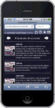
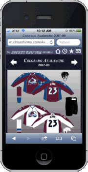
The team pages are formatted differently than what's on the full-size version. When you tap on a team's logo, you will see something that looks something similar to the image on the left. The thumbnail image appears next to its description. Tap on a thumbnail image to zoom in. You will notice arrows flanking the team name at the top. On the index pages, tapping the arrows will go to the next team in alphabetical order by geographical name. On the image pages, they'll take you to the next image in sequence. It's hard to tell from the image on the right, but when you zoom in on an image, the team name becomes underlined. That serves as your link back to the index page. Tap on it to go back to the team's index.
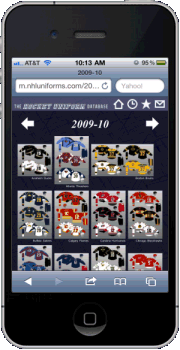
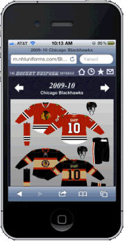
The season pages look just like the ones on the full-size version, with the filler content omitted. Tap the arrows next to the year on the index pages to go one season ahead or back. As with the team-by-team images, the arrows next to the header on the image pages will take you to the next (or previous) image in sequence. And again, on the image pages, the season is underlined, as that is your link back to the season's index page. So, what do you have to do to get in on all the fun? Well, I have set up the site to automatically take you the mobile version any time you enter nhluniforms.com in the URL bar on a mobile device. But in case it doesn't work and you get the full version, you can type in m.nhluniforms.com to go to the mobile site. And as I mentioned earlier, just tap on the website logo or the home icon at the top to go back to the menu. I also included the history and blog sections on the mobile site. Those of you with the iPhone 4 (and later versions as Apple releases them), the news gets even better! I'm wrapping up a high-definition app of The Hockey Uniform Database, taking advantage of the device's retina display. I've tested it out, and let me tell you -- it looks stunning! Stay tuned to this section to find out when it will be available on the app store. |
Other posts 2011-12: New insight into the Maple Leafs' 1977-78 name-on-back protest Mystery of 1928-29 Pittsburgh Pirates solved? Winter Classic uniforms revised New York Rangers Winter Classic jersey unveiled Philadelphia Flyers Winter Classic uniform unveiled New York Islanders alternate uniform unveiled As seen in the Toronto Maple Leafs media guide Toronto Maple Leafs alternate uniforms unveiled (well, sort of) Ottawa Senators alternate uniforms unveiled (well, sort of) Winnipeg Jets uniforms unveiled |


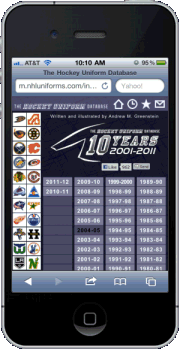 Well, after what seemed like an eternity in working on it and perfecting it, I give you a gift as we open the 2011-12 NHL season -- a mobile-enhanced version of The Hockey Uniform Database! Although this was designed with the iPhone in mind, it should work on other mobile platforms as well, including Android and Windows Phone. So now, you no longer have to be tethered to your desk or have to lug around your laptop to look up the history of your favorite team's uniform -- you can now take it with you in your pocket!