Hartford Whalers


1979-82, 1983-85
The Whalers' uniforms underwent a complete redesign from the ones they wore at the tail end (no pun intended) of their WHA years. Then, the team's colors were green and gold. The gold was replaced by royal blue. The WHA crest featured the letter "W" with a spear running through it. The spear disappeared, and a new crest was introduced, featuring a "W" with a tail emerging from the top. In one of the most ingenious designs ever, the negative space in the logo forms the letter "H."


1982-83
In 1982, the Whalers joined the Philadelphia Flyers in wearing long pants. The new design, dubbed Cooperalls, was supposed to make for a lighter uniform. It made players faster all right -- especially when they were upended and slid on the ice. The league quickly recognized the hazard the long pants created and outlawed them after the 1982-83 season. The team reverted back to its previous short pants and socks the following season.


1985-89, 1990-91
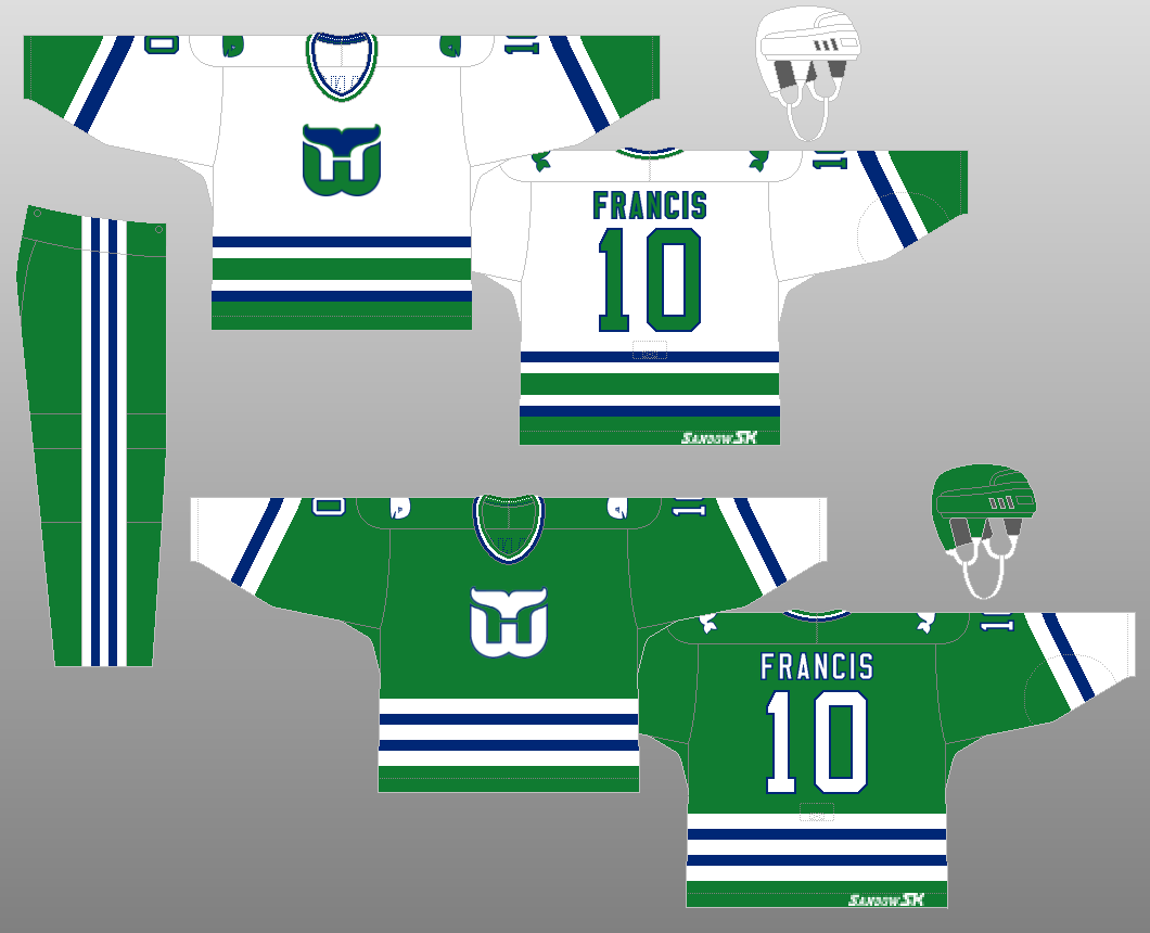
The jerseys underwent a few minor changes for the 1985-96 season. On the home jersey, the bottoms changed from green to white. On the away jersey, the stripes now extended to the very bottom. On both jerseys, "Pucky," which had previously adorned the shoulders, was harpooned.
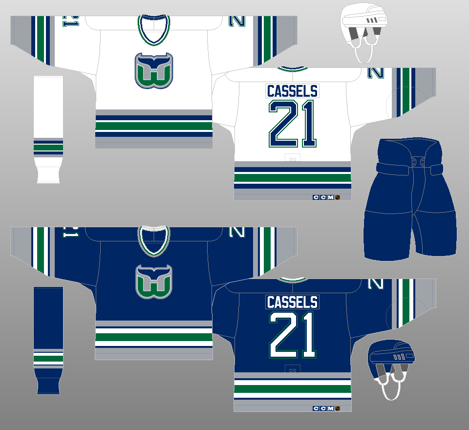

1989-90
The sleeve stripes become straight for the 1989-90 season. They'd revert back to its angular design the following season.


1991-92
The sleeve stripes become straight once again in the 1991-92 season and are positioned a little further down the sleeves.


1992-97
For the team's final five seasons in Hartford, they wore redesigned uniforms. Their primary color was now navy blue, with green relegated to an accent color, along with silver. The shape of their logo stayed the same, incorporating the team's new colors.