|
 |
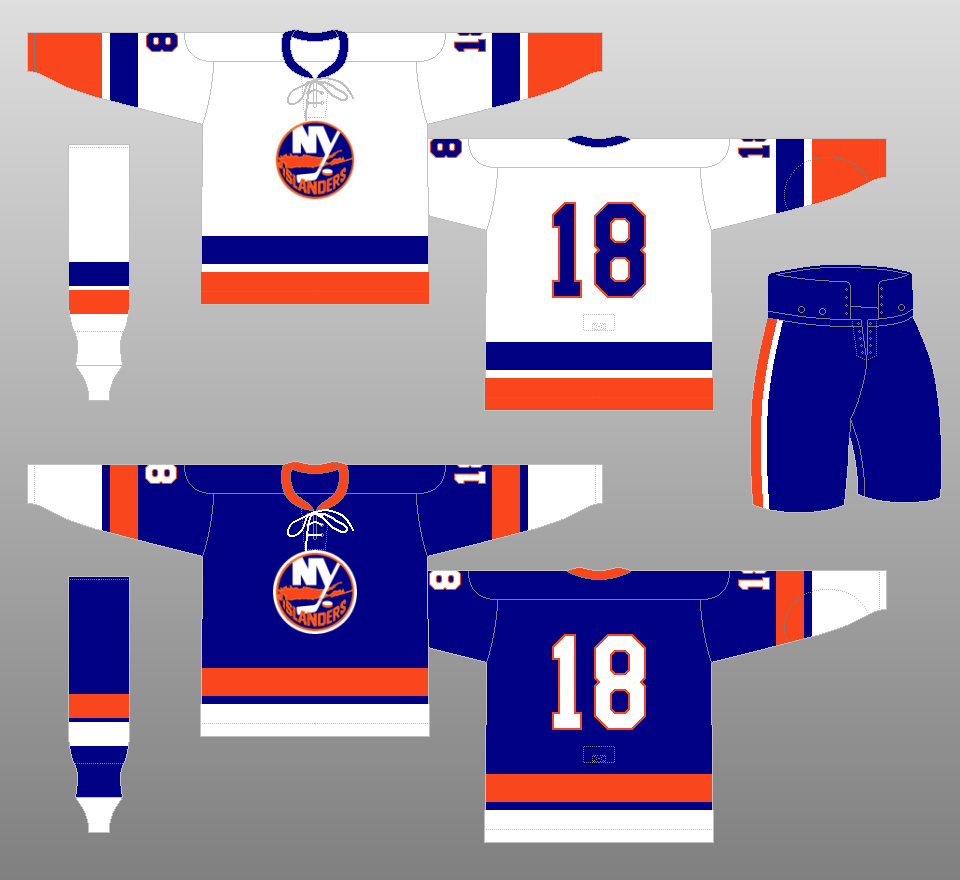
1972-73
New York's newest team debuted in 1972 wearing New York's official colors of blue and orange. Look carefully on the careful positioning of the word "Islanders" on the crest in relation to the image of Long Island. The letter "I" points to almost the exact location of Nassau Coliseum on Long Island. |
|
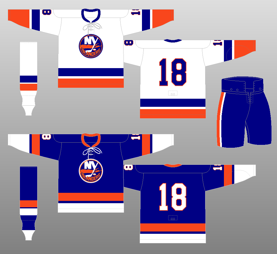 |
1973-76
The numbers underwent a slight change in the team's second season. On the blue jersey, the numbers changed from orange to white. |
|
 |
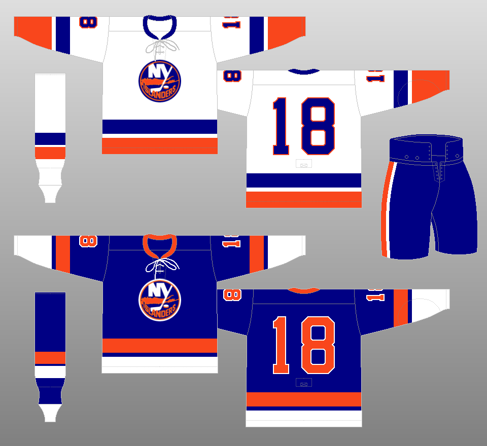
1976-77
The outer blue trim on the home crest disappears. Actually, the team uses the same crests used on the blue away jerseys, which come with a white outer outline, on their white home jerseys. |
|
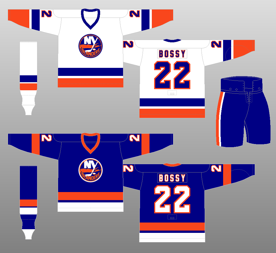 |
1977-78
The stripes on the away jerseys change, the tie-down neck becomes a V-neck, and names are added to both jerseys. |
|
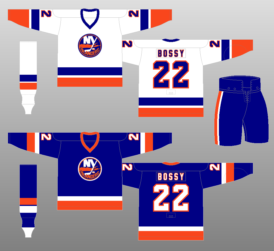 |
1978-84
The stripes on the away jerseys change again. It was in these uniforms that the Islanders would win their four consecutive Stanley Cups in the early 1980s. |
|
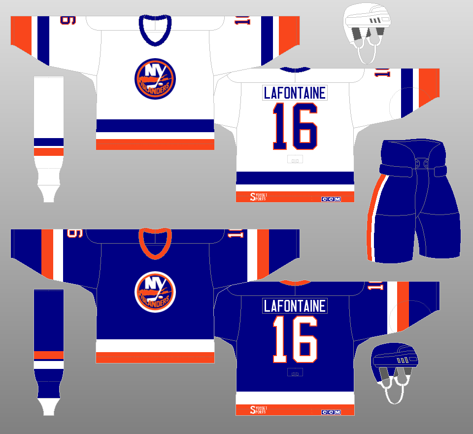 |
1984-95
The names go from two-color to one-color. |
|
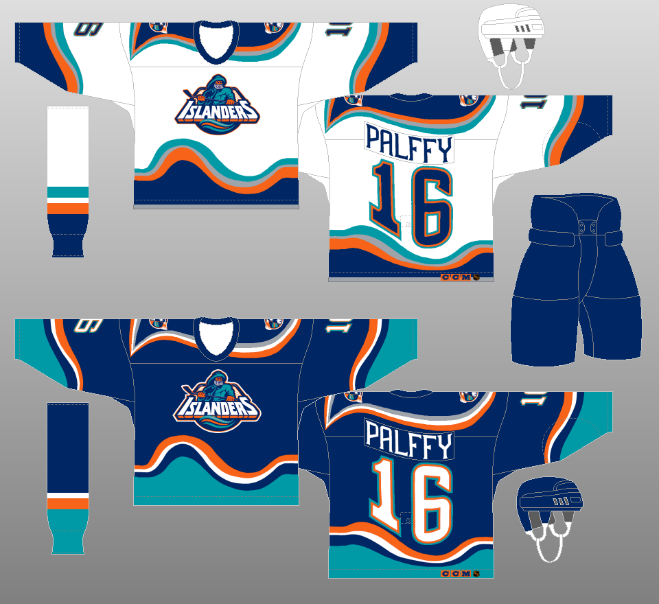 |
1995-97
In one of the most ill-fated moves in NHL uniform history, the Islanders ditched their trademark royal blue/orange uniforms in favor of a uniform set that a 1960s stoner would have been proud of. The crest was replaced by one featuring a man bearing a striking resemblance to the Gorton's fisherman. The backs of the jerseys featured names and numbers distorted to follow the contours of the bottom stripes. Needless to say, this uniform set was not well-received by Islanders fans. |
|
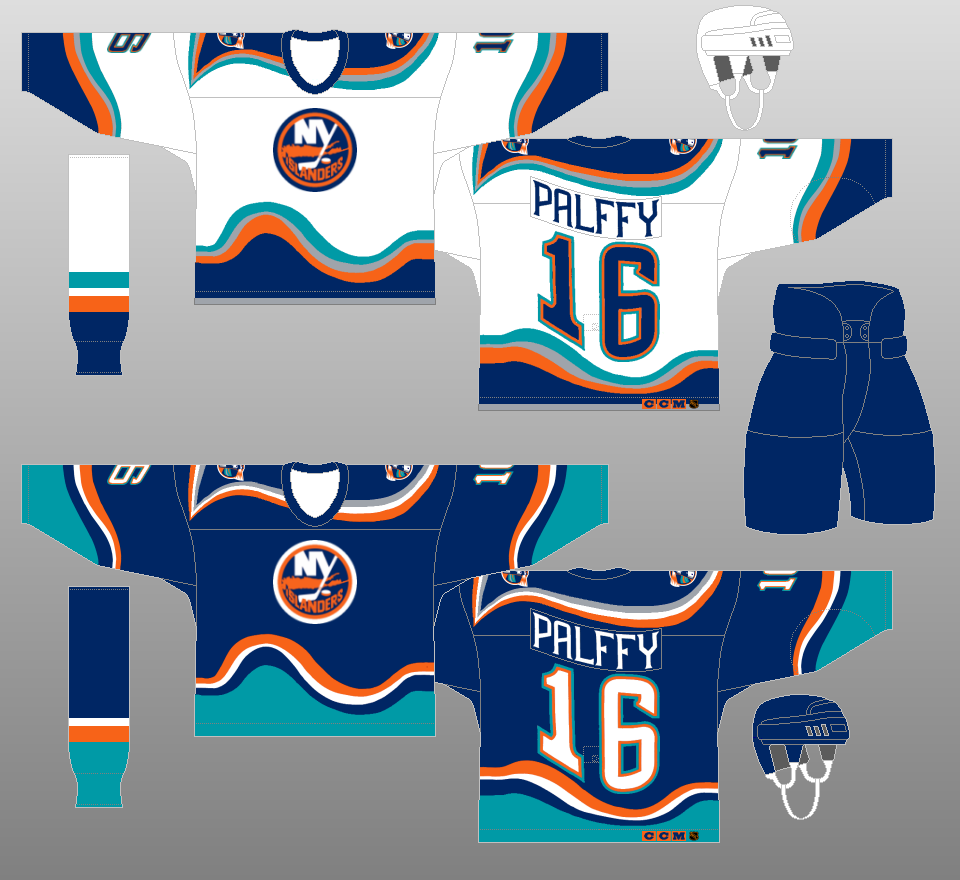 |
1996-98
In part one of making things right with Islanders fans, the team placed the old logos on the new jerseys in the 1996-97 season. Those jerseys were rotated with the ones with the Gorton's fisherman crest for that season. They were worn exclusively in the 1997-98 season. |
|
 |
1998-2002
In part two of making things right with Islanders fans, the team returned to their original design in 1998, keeping navy blue as its primary color. The jerseys feature a patch on the right shoulder featuring four diagonal stripes, symbolizing the team's four Stanley Cup titles in the 1980s. |
|
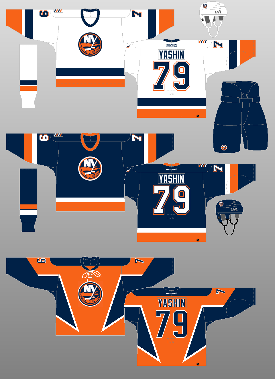 |
2002-07
The team introduces a new orange alternate jersey. |
|
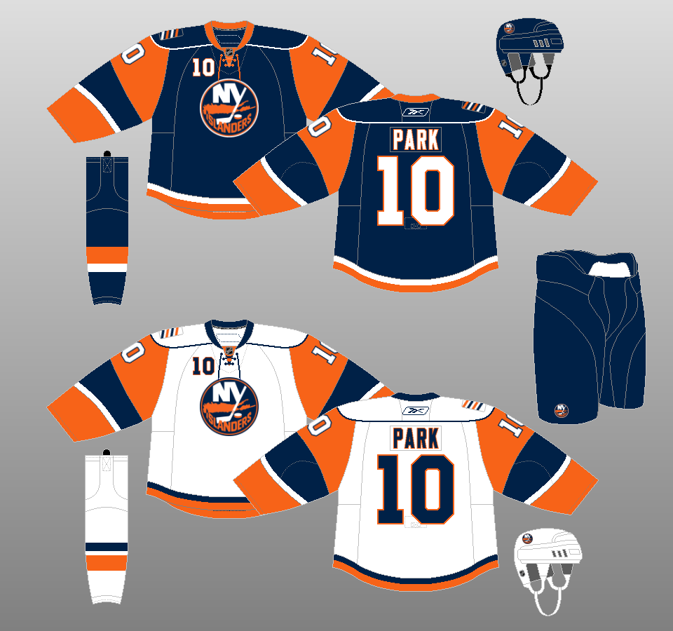 |
2007-08
Apparently not learning its lesson from the previous decade, the Islanders introduce a new design when the reebok Edge uniform system takes over the NHL. They kept the crest and colors, but they changed their tail stripes, and their sleeves became primarily orange. |
|
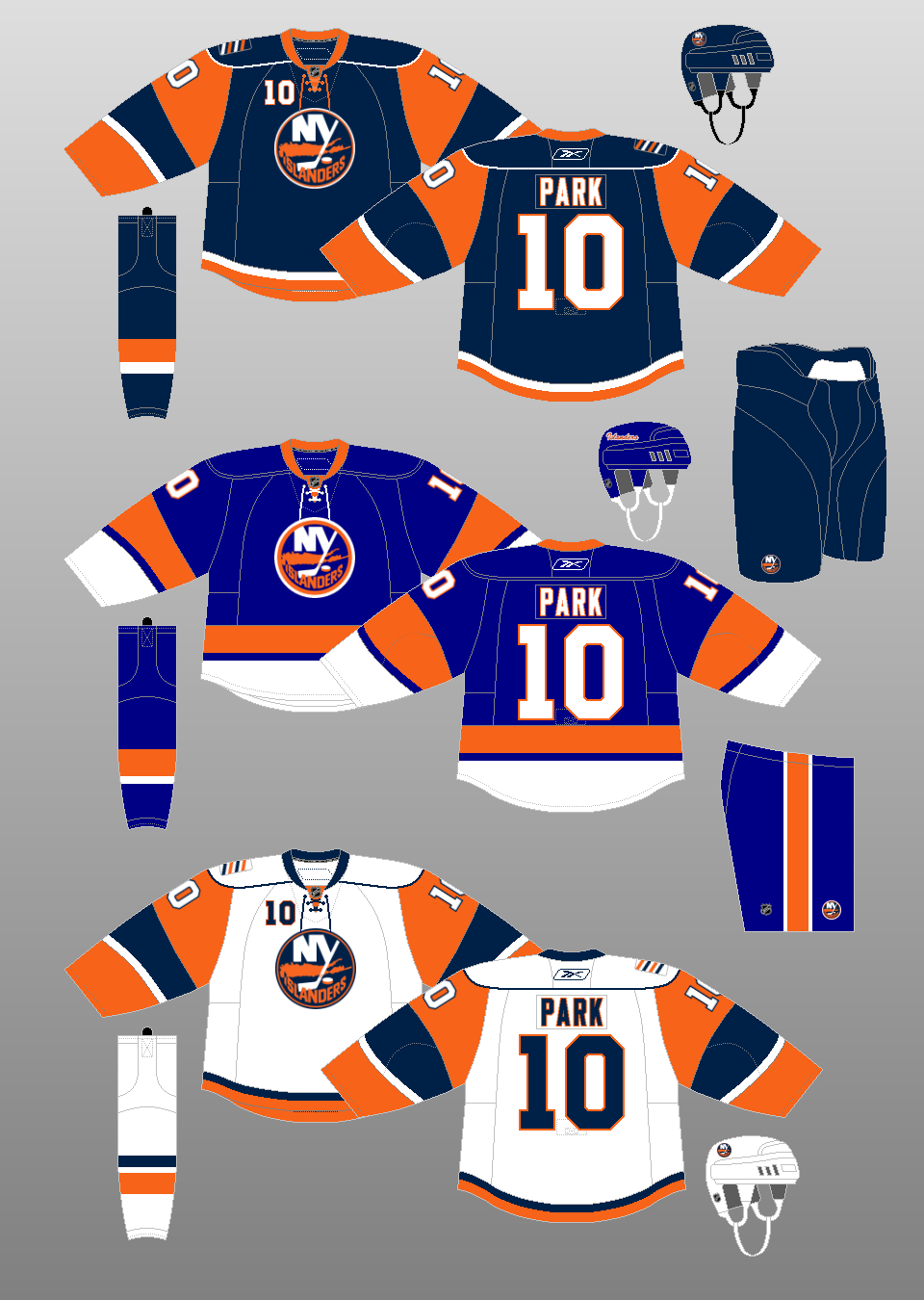 |
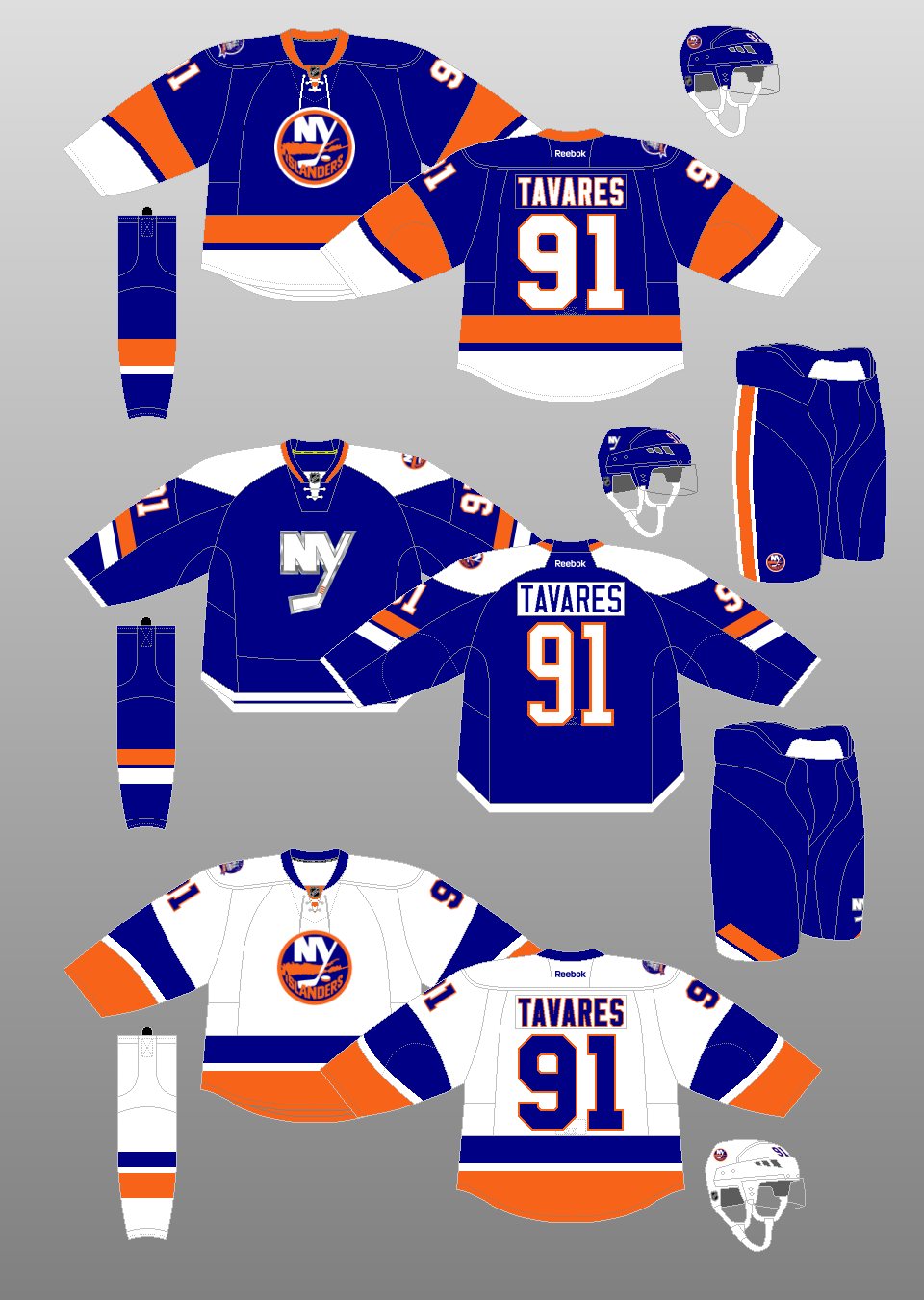
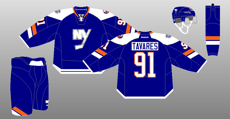
2008-10
The Islanders use their original blue jersey as its new alternate uniform, complete with matching pants and hemlet. On the "Y" in the alternate's crest, there are now four stripes instead of three. The significance? You guessed it -- the four Stanley Cups the team won in the 1980s. |
|
 |
2010-11
It's truly back to the future with the Islanders as they change their road uniform to match their original design. One thing of note is the lack of an outer blue trim on the crest -- the only season the Islanders wore the crest on their white jerseys this way was in 1976-77. |
|
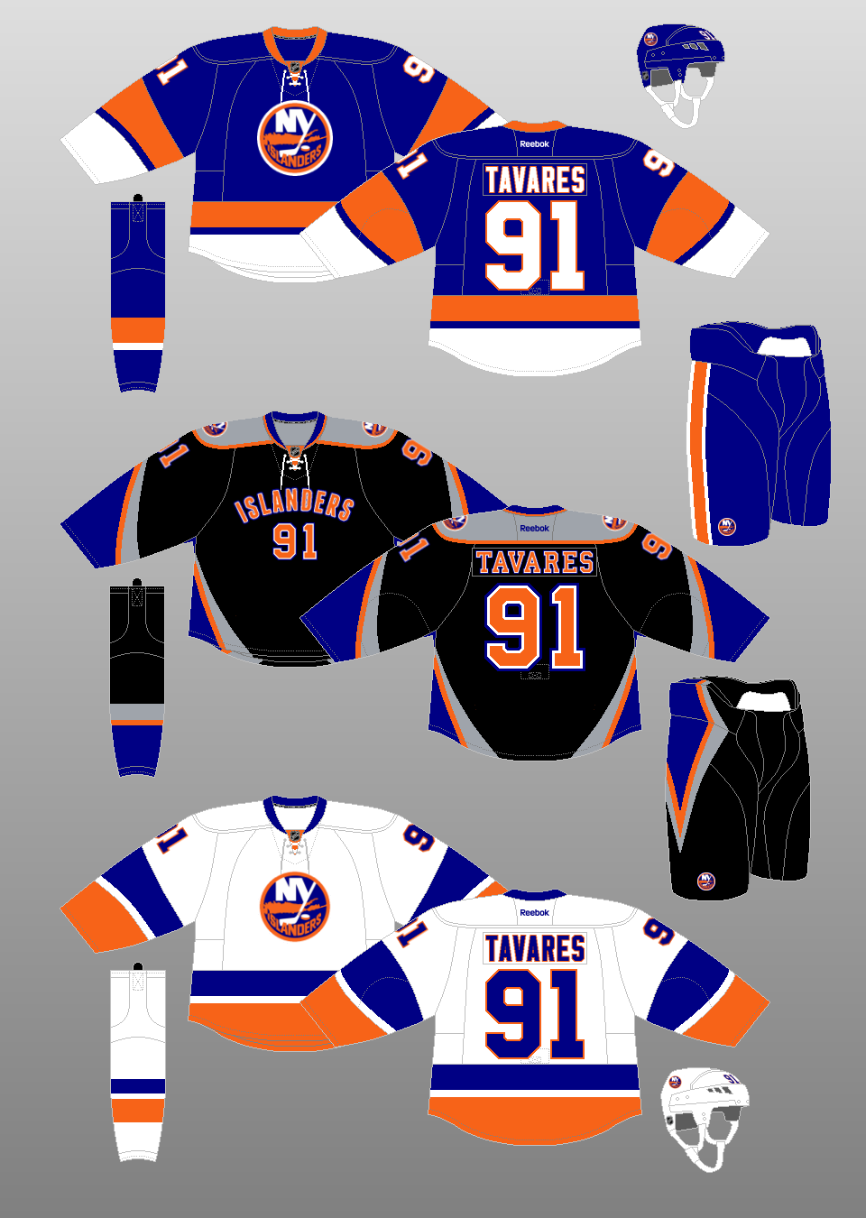 |
2011-14
Just as the city's other professional sports teams start to phase out black from their color schemes, the Islanders break out a new black alternate uniform, featuring the "beloved" wordmark-with-number-underneath front treatment. The side panels on the jersey and pants have a diamond effect when worn. |
|
 |
2014-15
With the Stadium Series uniform worn the previous season proving to be galaxies more popular than their black alternate uniform, the Islanders made their Stadium Series uniform their new alternate, retiring the black uniform. |
|
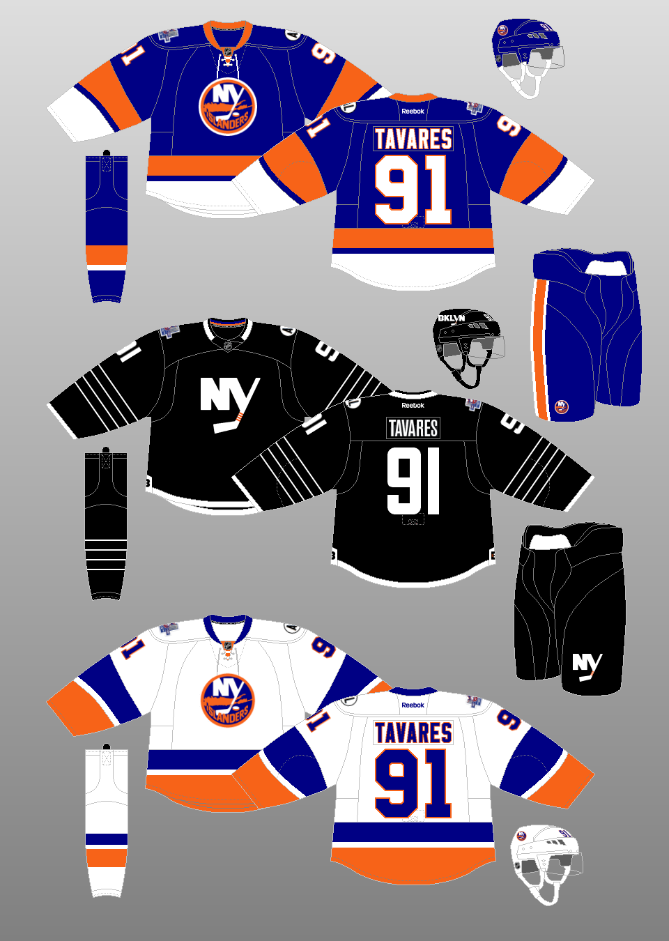 |
2015-17
The Islanders try again with a black alternate uniform -- this one in honor of their inaugural season in Brooklyn. It comes complete with four stripes on the sleeves and on the socks. Again, three guesses as to what they symbolize. |
|
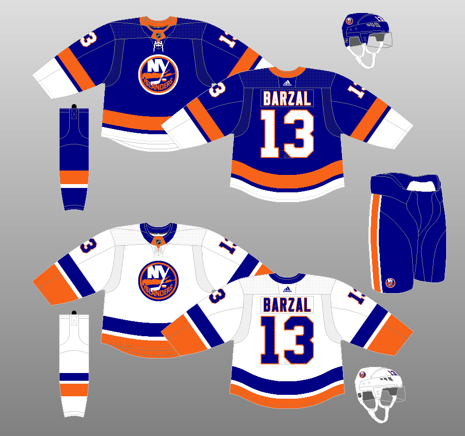 |
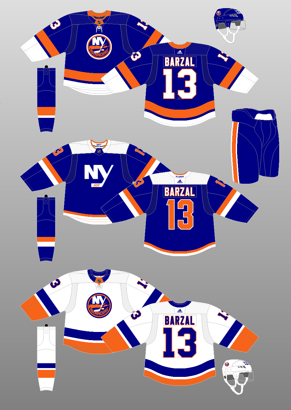
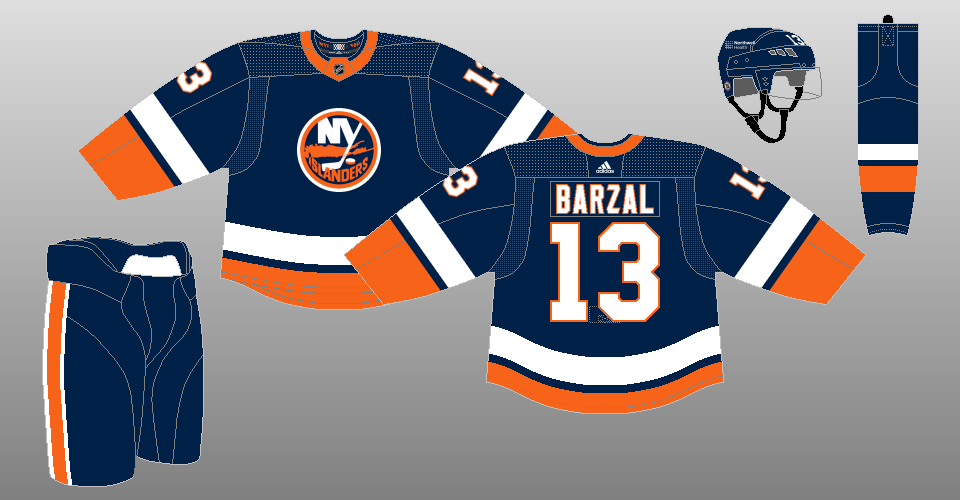
2017-18, 2024-present
The Islanders retire their black alternates and carry over their primary designs to the new Adidas Adizero jersey system. The outer blue trim on the road jersey's crest is also restored after years of absence. |
|
 |
2018-24
The Islanders introduce a new blue alternate uniform, featuring an NY crest with four diagonal lines for the stick tape. By now, you should be able to figure out the significance of the four lines. |
|
Special Event Uniforms |
 |
2014 Stadium Series
The Islanders wore these uniforms as they lost to the Rangers, 2-1, at Yankee Stadium on January 29, 2014. The Islanders would make this uniform their new alternate uniform the following season. |
|
 |
2021 Reverse Retro
In easily the laziest Reverse Retro treatment, the Islanders take their 1979-80 home uniform, reverse the white and blue parts and darken the blue to the shade they wore in the late 1990s/early 2000s. The end result is a look that is nearly identical to that of their regular home uniforms. |
|
 |
2022-23 Reverse Retro
The Islanders attempt to re-create their fisherman uniform from 1995, eliminating teal from the color palette. Perhaps due to the degree of difficulty in re-creating that uniform, the end result doesn't quite look the same as the original. |
|
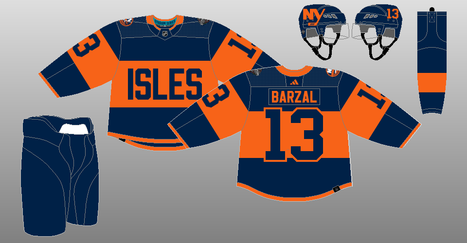 |
2024 Stadium Series
It's all navy blue and orange and no white in the Islanders' 2024 Stadium Series uniform as they take on the Rangers as the designated home team at MetLife Stadium in East Rutherford, New Jersey. |
|