|
 |
1970-72
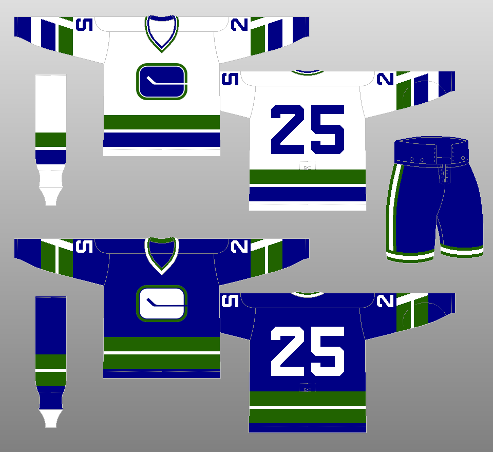
The Canucks took to the ice in 1970 wearing blue, green and white uniforms. Their logo, the "stick-in-rink" logo, actually forms the letter "C," as the stick extends beyond the right edge of the logo. |
|
 |
1972-77
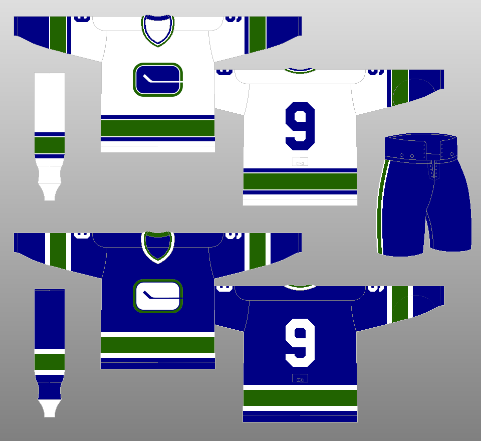
The "stick-in-rink" logo becomes a little more squat, more closely resembling the actual dimensions of a hockey rink. Also, the jersey stripes change, and the "V" inside the sleeve stripes disappears. |
|
 |
1977-78
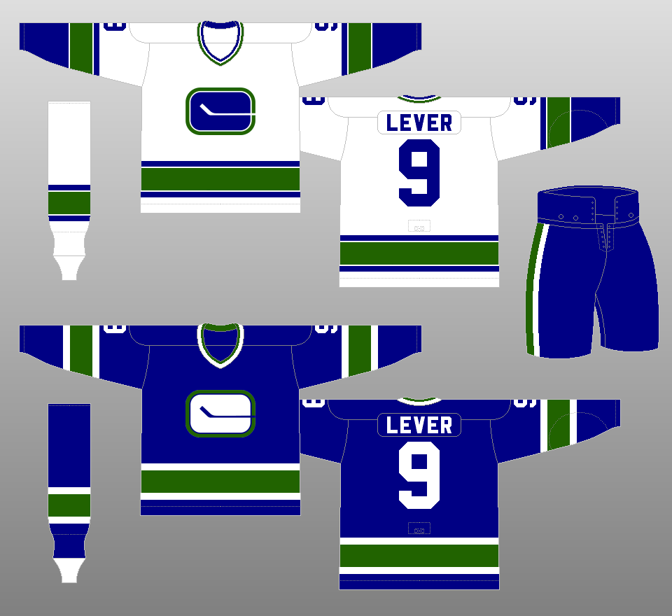
Names are added to the jerseys, thanks to a new NHL rule mandating them. |
|
 |
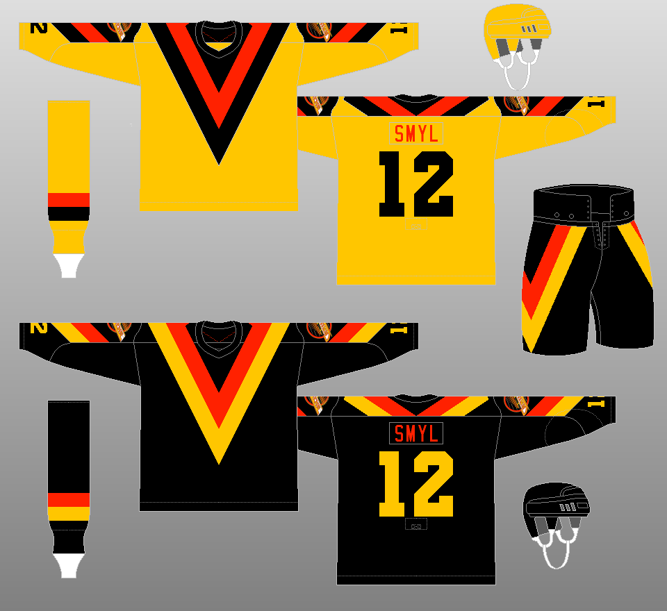
1978-79
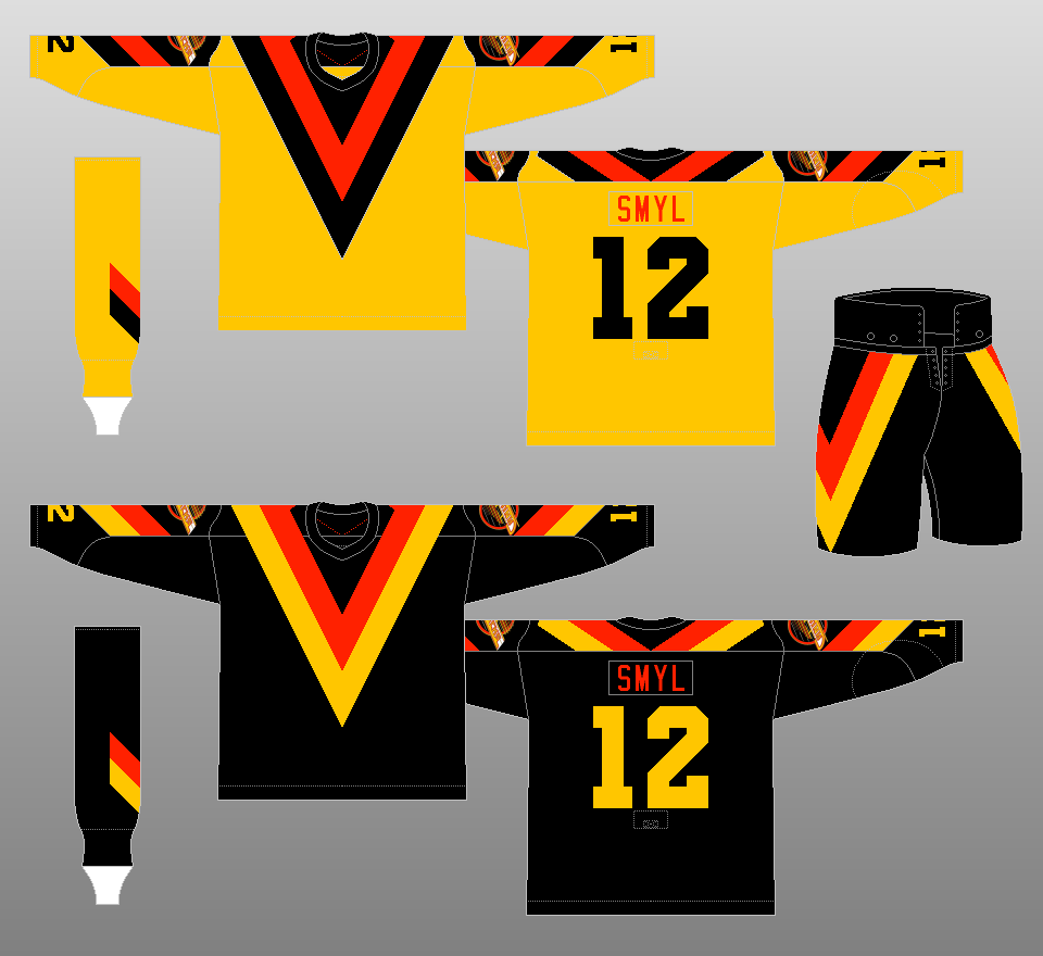
In one of the most talked-about uniform moves in NHL history, the Canucks ditch their conservative blue and green color scheme in favor of one comprising of black, gold and orange. The redesigned crest is relegated to the sleeves, as the front of the new jerseys contained a gigantic "V." It's one of seven "V's" to adorn the new uniform, including two on the pants and two on the socks. This uniform set is widely regarded as one of the ugliest in the history of North American professional sports. |
|
 |
1979-80
The "V's" on the socks go away, in favor of horizontal stripes. |
|
 |
1980-81
The sleeves on the home jersey undergo a slight change. |
|
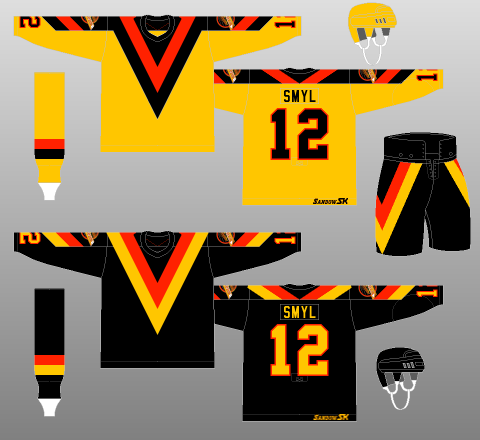 |
1981-82
The orange names change to black on the gold jerseys and gold on the black jerseys. The numbers are now trimmed in orange. |
|
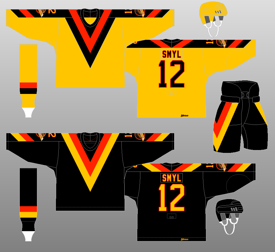 |
1982-85
The sleeve numbers, which had been at the very bottom of the sleeves, are repositioned to above the sleeve crests. Names are now trimmed in orange. |
|
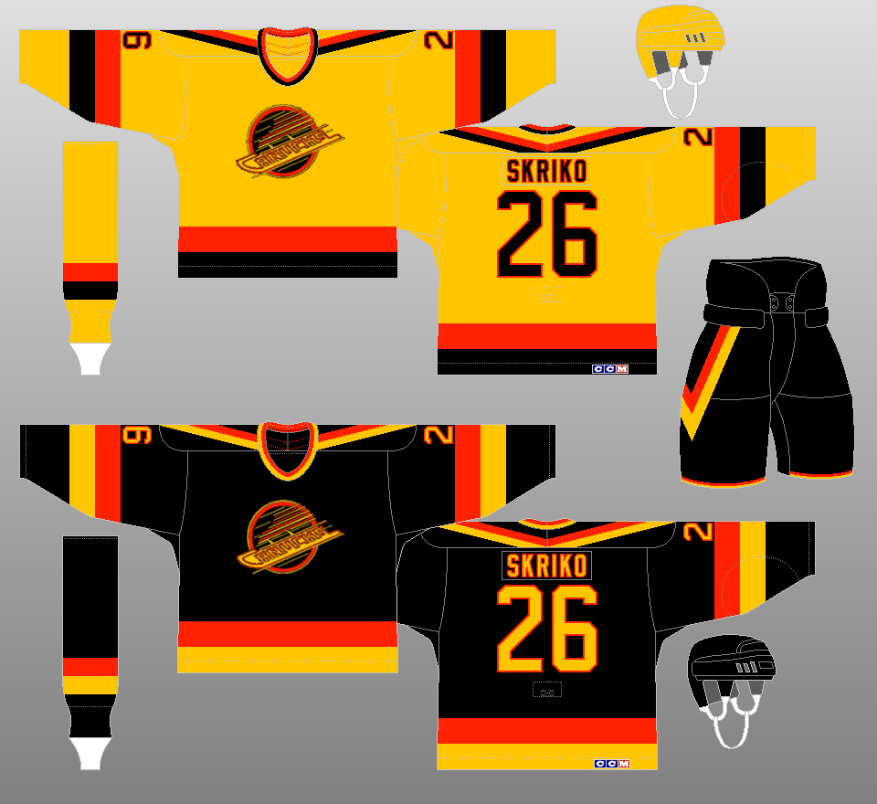 |
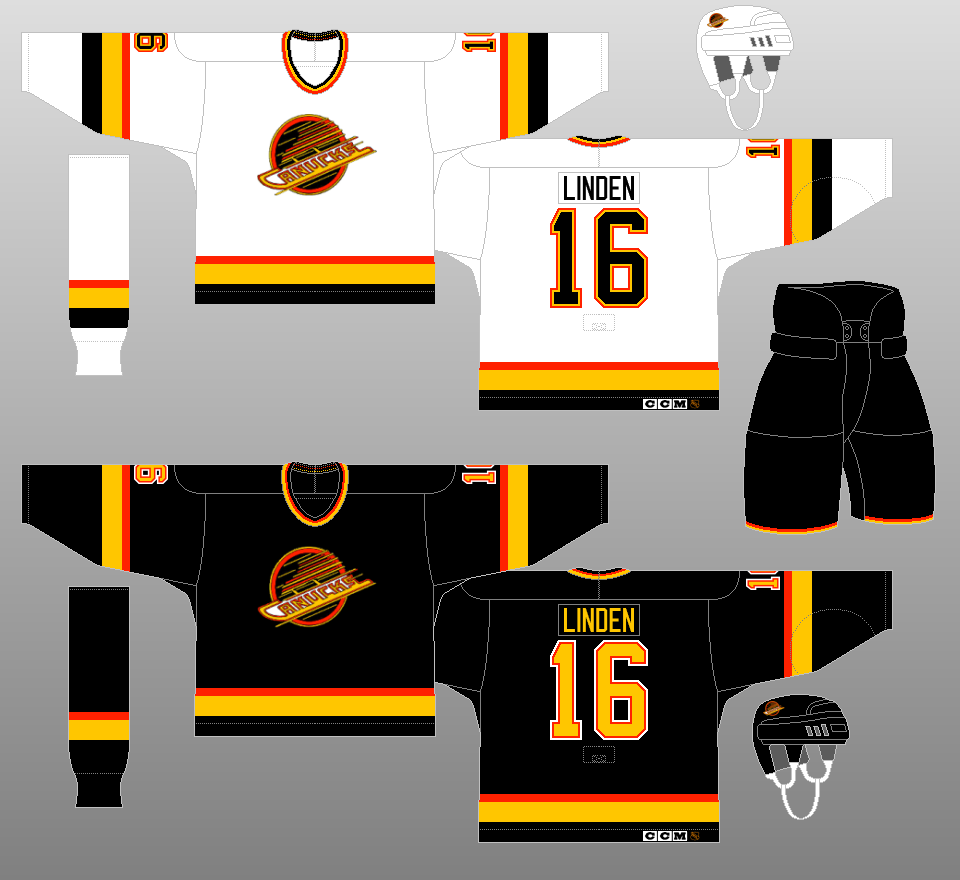
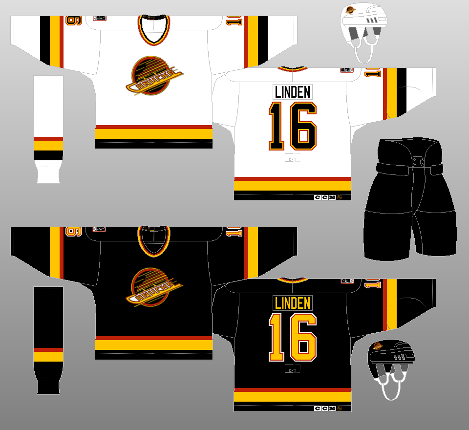
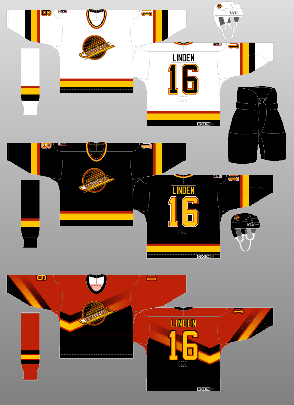
1985-89
The wildest jerseys in NHL history become a little more subtle, with the crest being relocated to the front of the jersey. There are now only four "V's" on the jersey -- two on the shoulders and two (thinner) ones on the pants. |
|
 |
1989-92
The gold home jerseys give way to white ones, and the "V's" completely disappear from the uniform. |
|
 |
1992-95
The Canucks begin wearing a patch in support of Canuck Place, North America's first free-standing hospice for terminally ill children. Also, the orange trim color changes to red, and the stripes at the end of the pants disappear. |
|
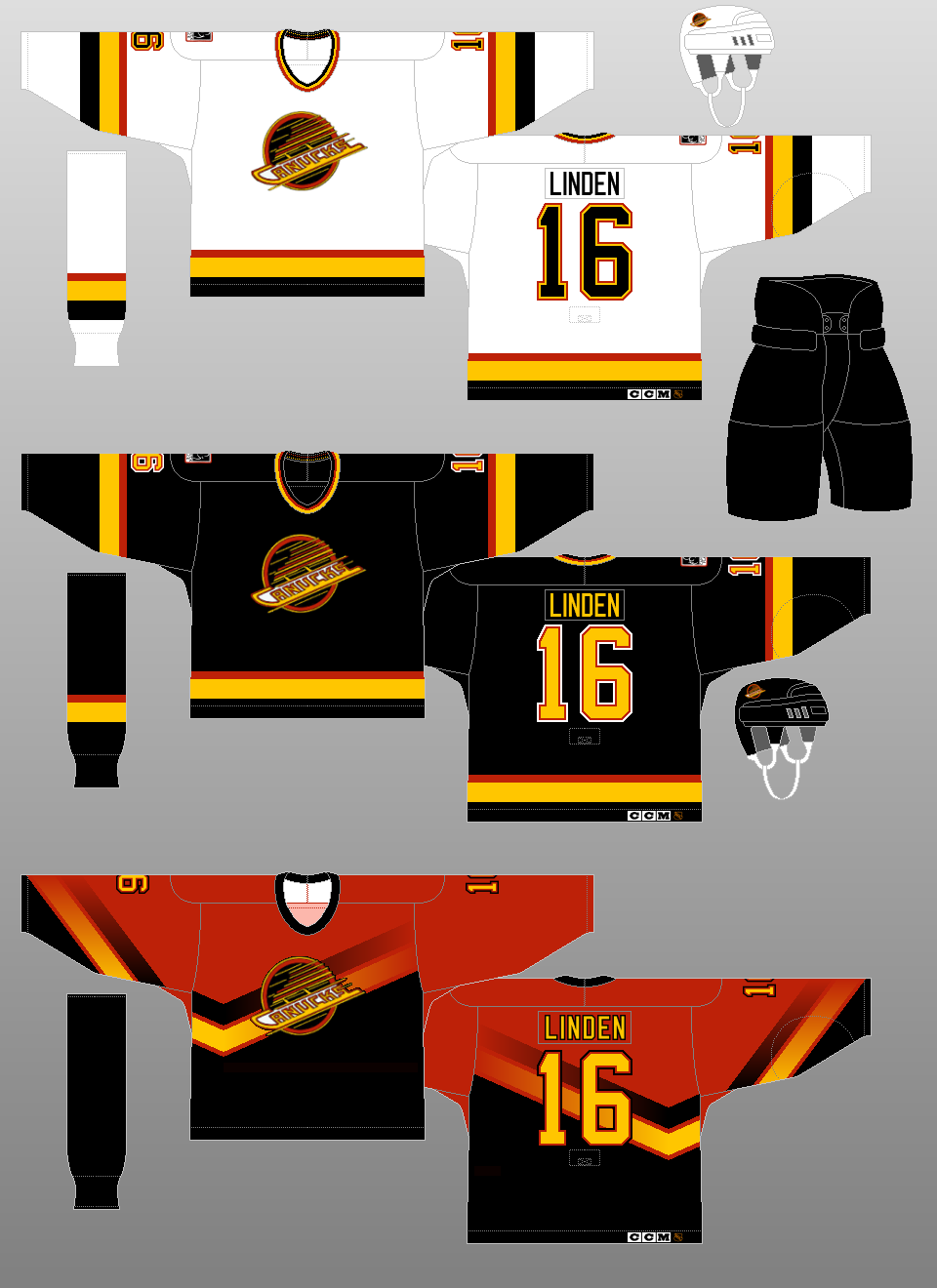 |
1995-96
The Canucks are one of the charter teams in the NHL's third jersey program, introducing a red jersey. |
|
 |
1996-97
The socks worn with the alternate jersey change from solid black to red with black and gold stripes. |
|
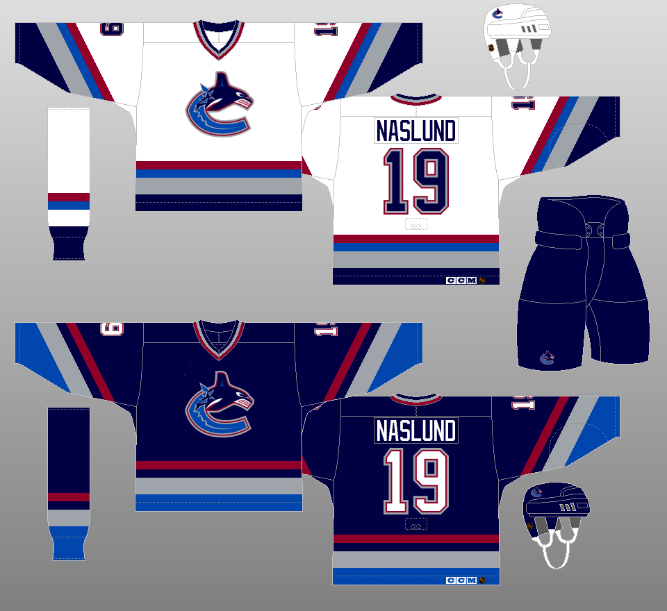 |
1997-2001
The black, gold and red give way to navy blue, sky blue, maroon and silver. The crest is a nod to the team's parent company, Orca Bay Sports & Entertainment. |
|
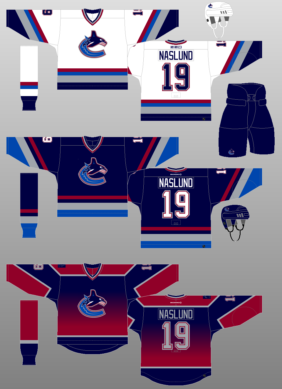 |
2001-03
A new alternate jersey is introduced, featuring a torso that changes from navy blue to maroon. The jersey features a redesigned Canuck Place patch. |
|
 |
2003-06
The team's original logo, the "stick-in-rink," is reintroduced in the team's current colors and is placed on the shoulders (except for the alternate jersey). |
|
 |
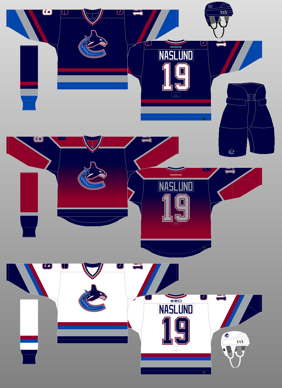
2006-07
The alternate jersey is replaced by a vintage jersey that had been worn on occasion the previous two seasons. |
|
 |
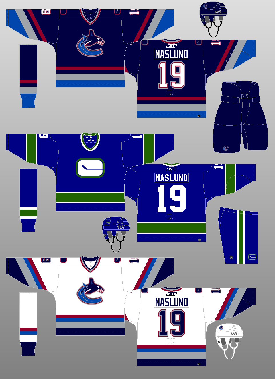
2007-08
The Canucks return to their original colors (with silver thrown in for good measure) for their new Reebok Edge uniforms. The crest that the team had since 1997 was recolored to fit the new color scheme, and the "stick-in-rink" logo was slightly modified to give it a more contemporary look. |
|
 |
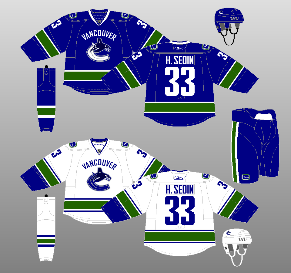
2008-17
The modern "stick-in-rink" logo becomes the crest for the team's new alternate home jersey. The secondary logo features the inspiration for the team's nickname, Johnny Canuck. |
|
 |
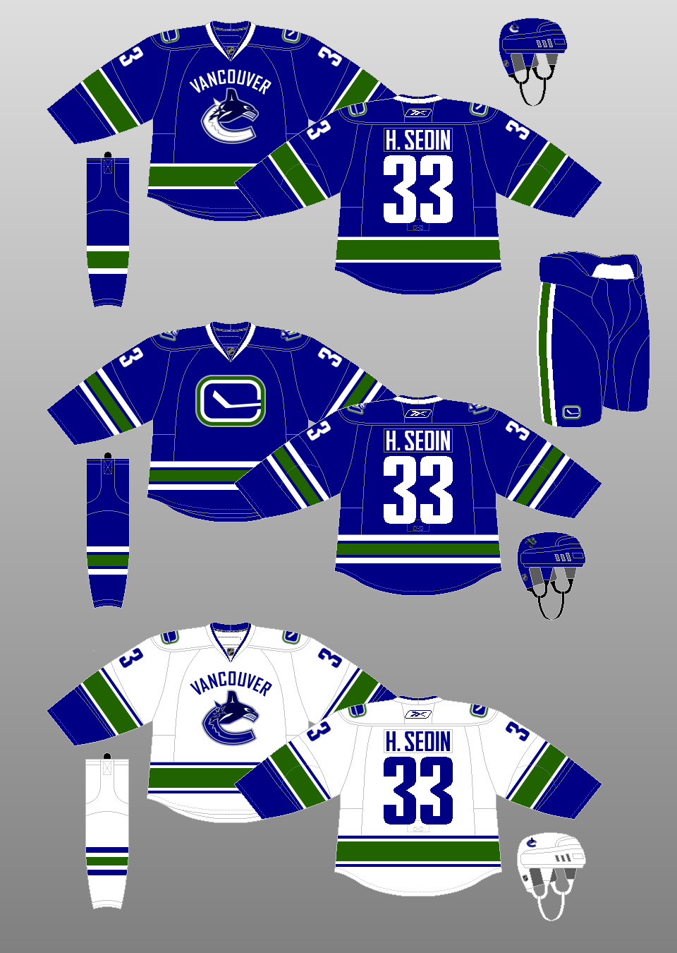
2017-19
The jerseys essentially stayed the same when the Adidas Adizero uniform system took hold. But the sock stripe widths were changed to match those of the jerseys. Also, like all others throughout the league, the alternate jersey was retired, at least for the time being. |
|
 |
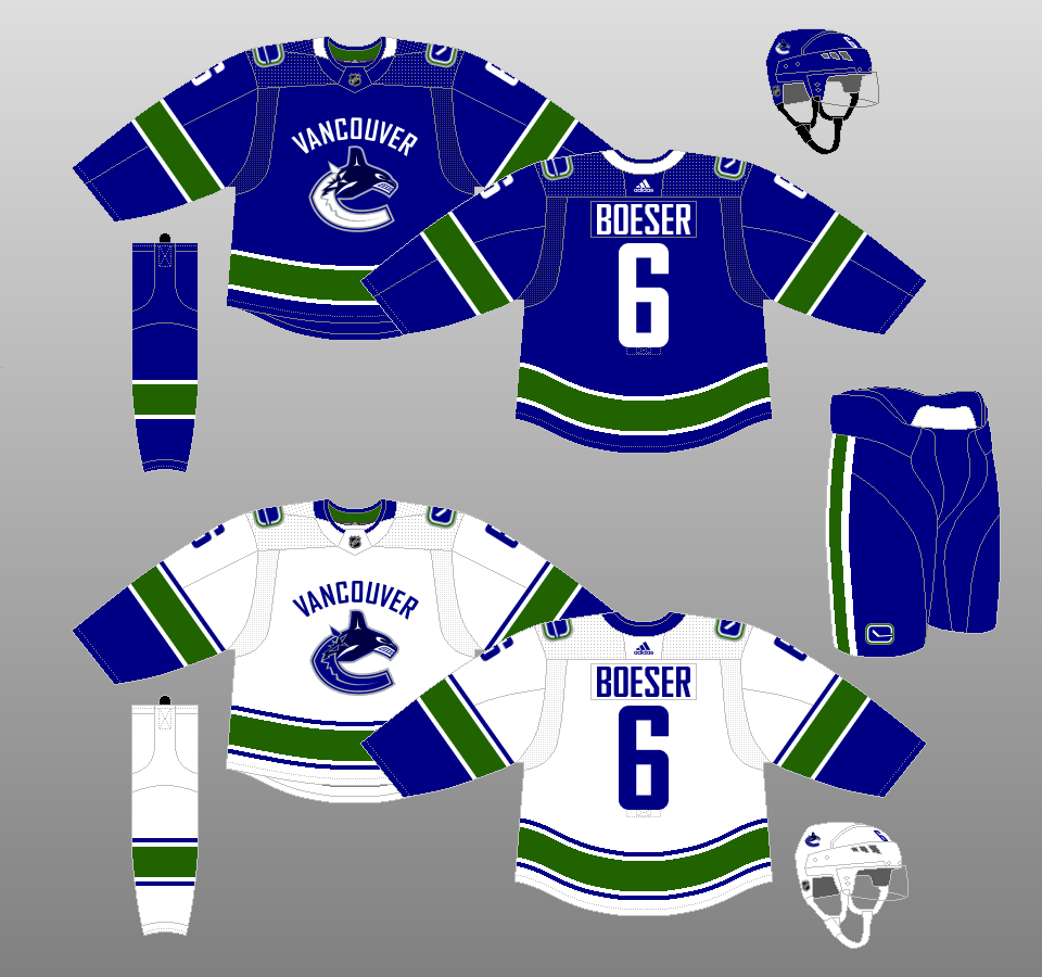
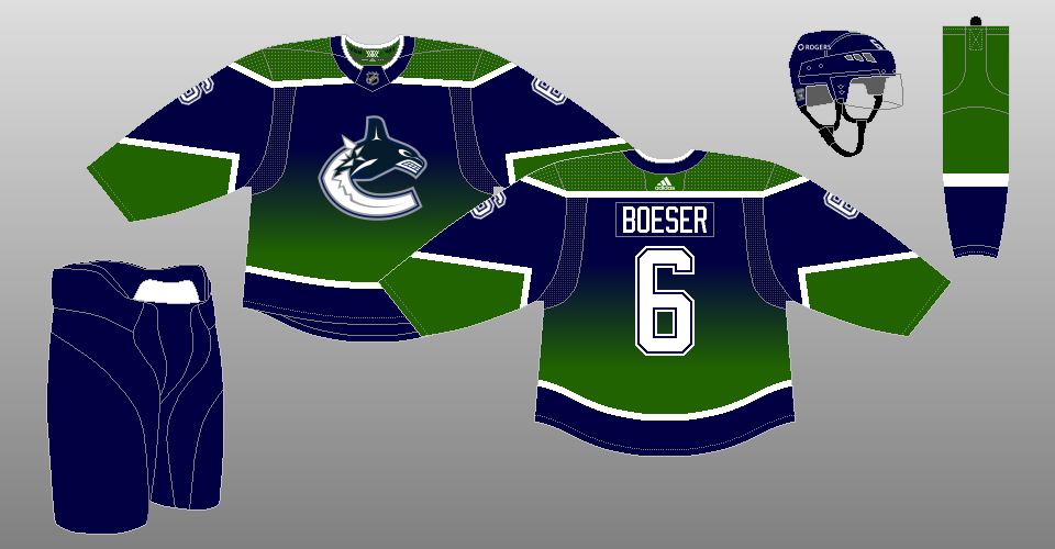
2019-22
The Canucks eliminate the VANCOUVER wordmark from above the crest. They also recolor the secondary logo to make white the dominant color, since NHL ice is painted white. The new alternate logo adorns the front of their new alternate jerseys, which uses a striping pattern similar to that worn on their inaugural uniforms. |
|
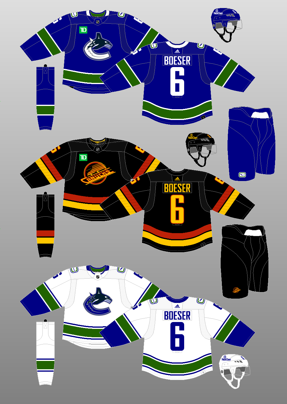 |
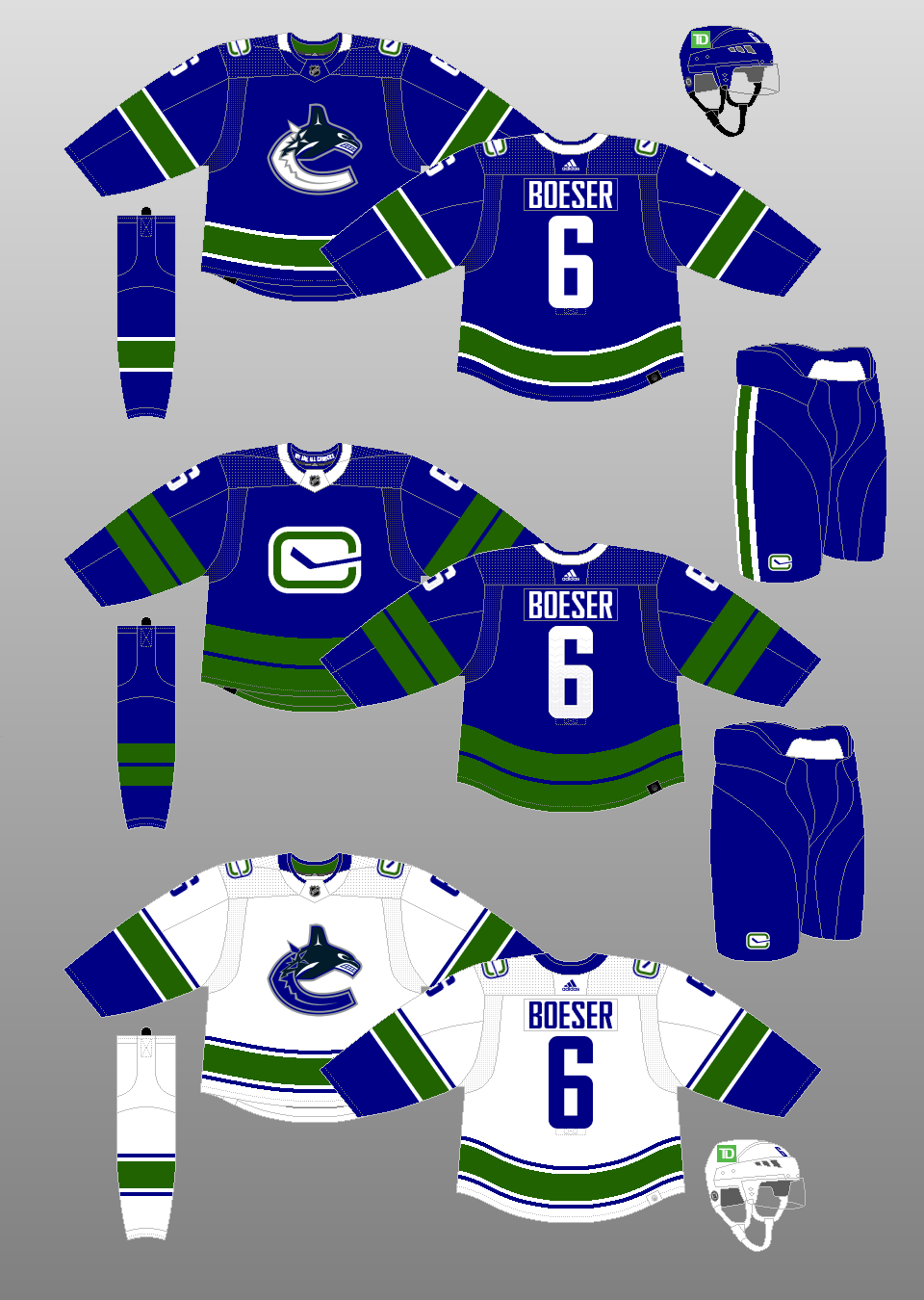
2022-present
The Canucks carry over their stripeless pants that they worn as part of their previous alternate uniform to their regular home and away uniform. Speaking of alternate, they introduce a new one based on their black uniforms from 1985-89. |
|
Special Event Uniforms |
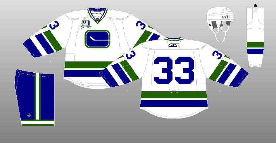 |
2010-11 40th Anniversary
The Canucks wore replicas of their original white uniform, complete with the lack of name on the back, as the team celebrated its 40th NHL season. |
|
 |
2014 Heritage Classic
With the roof closed at BC Place Stadium, the Canucks honored Vancouver's previous major professional hockey franchise, the Millionaires, as they lost to the Senators, 4-2. |
|
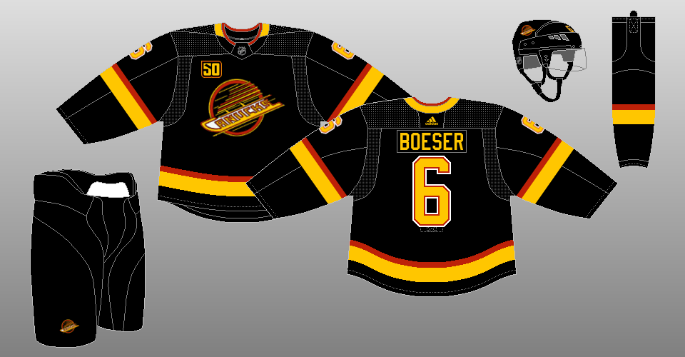 |
2019-20 50th Anniversary
To mark the Canucks' 50th anniversary, the team held a vote among its fans as to which throwback uniform to wear. The black skate uniform from the 1990s won out. |
|
 |
2021 Reverse Retro
The Canucks reintroduce their early 2000s alternate uniform, with green replacing maroon throughout. |
|
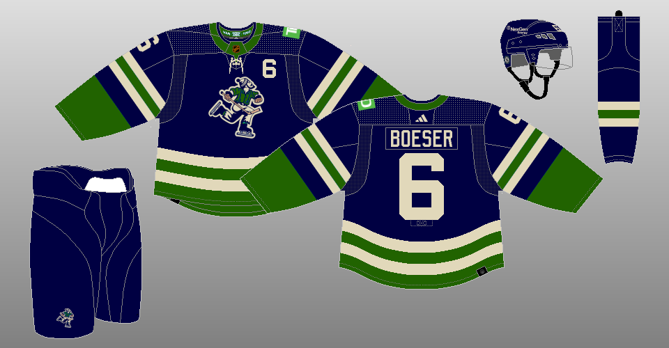 |
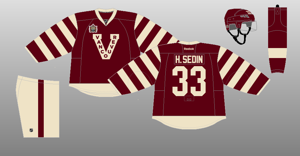
2022-23 Reverse Retro
The Canucks break out the uniforms of the 1962 Western Hockey League team of the same name, featuring the team's namesake, Johnny Canuck, on the front. The uniform is now colored in the Canucks' blue and green (albeit each in a different shade, along with vintage white). Note the era-correct number treatment, with the number on the upper left chest and on the right sleeve only. |
|